Designing Logos
We love the challenge of designing logos, synthesizing an idea, vision or concept and bringing it to life. Today's increasingly complex world of business communications makes creating an effective logo even more of a challenge. It is not just about designing a single mark, logo type or imprint anymore. Now a logo must meet many expectations, demands and applications. Think about it. The same logo must be equally clear and compelling on everything from Facebook, Instagram, or a website to a sign, a printed card or brochure, requiring multiple color and file formats.
To address these diverse needs, we focus on the process of discovery. We ask a lot of questions to get a deep understanding of the business—the story, mission, character, and goals—before we begin experimenting with permutations of the logo. We often explore multiple options before the logo ultimately reveals itself.
Three recent examples of logos
1. Avenue
Our logo for a brand-new restaurant in Medfield, Massachusetts incorporates several distinct elements. These elements can be used in different ways and configurations, either together or separately. This approach allowed for flexibility and variety when designing Avenue's signage, menus, check presenter, matches and website. As we worked, we were reminded that designing for a restaurant is almost like designing for theatre: a restaurant is a show that goes on every night. A good logo helps set the pace and the tone of the performance.

Avenue Logo variations, menu cover + check presenter

Exterior Signage: hanging lit sign, sign band and vinyl on glass
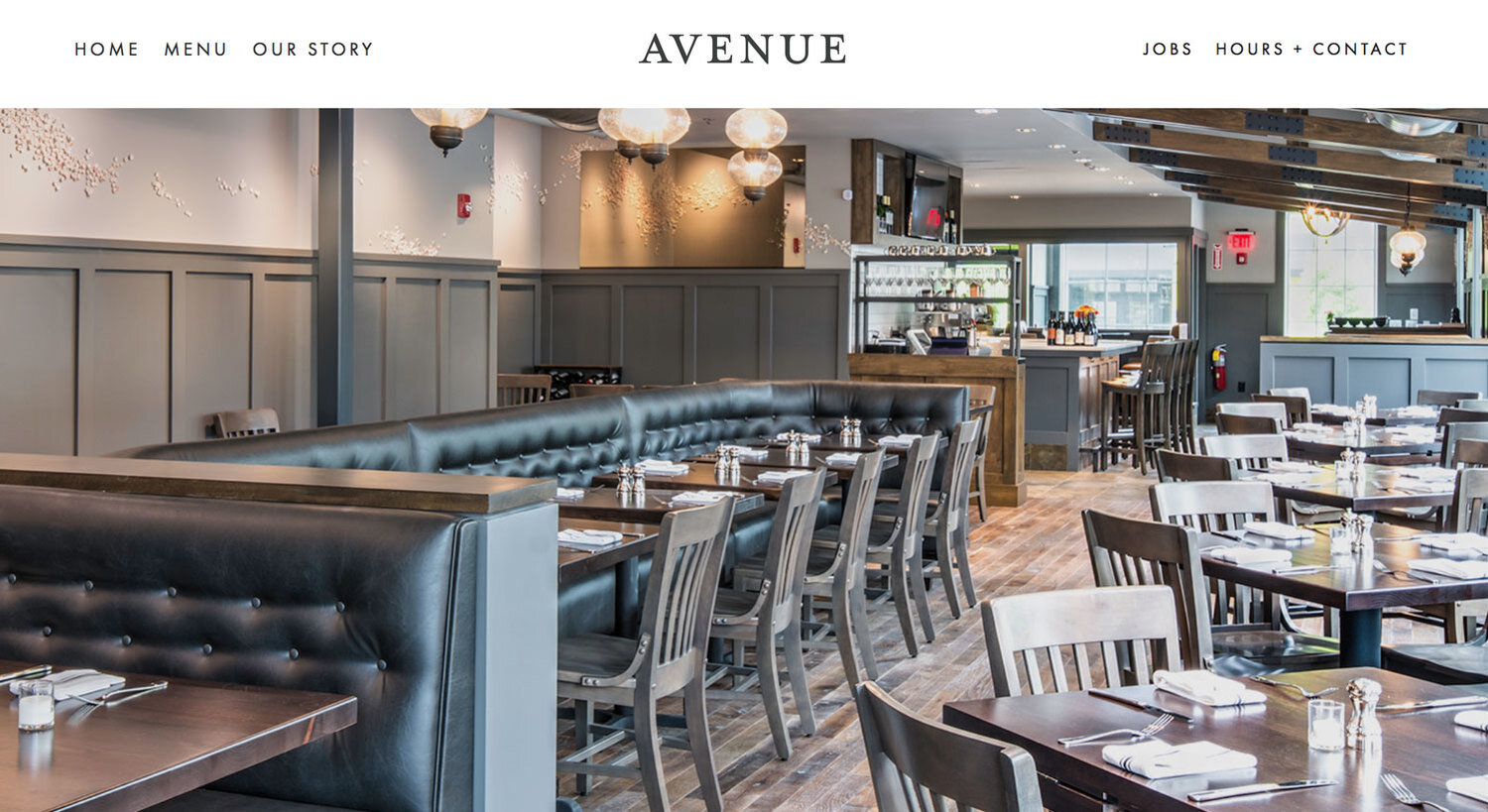
Avenue Website Design
2. Good Collective
This new online shopping site, still under development, needed a look that stays fresh in the curated online retail market. Once we settled on the type solution, we created a bright and lively color palette that conveys the stylish, savvy personality of the business. The different colors also allow for change, either seasonally or to announce sales.

While researching fonts, we fell in love with many type styles. Rather than give them up, we used them as graphic images for site highlights.

3. EVkids
After re-evaluating its organizational message and unifying its marketing strategy, this nonprofit realized it needed a new logo. The goal was a logo that was friendly, accessible, and emphasized kids while incorporating a new tagline to highlight their mission. The logo also needed to be simple enough for the staff to use and manage in-house. Having worked with many non-profits, we understood the challenges that EVkids faced and made the design process as easy as possible, and delivered appropriate logo files, Word templates and style guidelines.
